YO! Sushi
Advertising Creative, Art Direction, Campaign Development
YO! Sushi built its reputation on bringing the energy, authenticity and irreverence of modern Tokyo to the UK high street — and that spirit was the creative foundation for everything in this campaign. Bold, culturally rooted and designed to cut through, the work drew directly from the visual language of Japanese street culture: Kanji typography, high-contrast graphic sensibility and the kind of confident, unapologetic aesthetic that feels as at home on a Tokyo wall as it does on a London billboard.
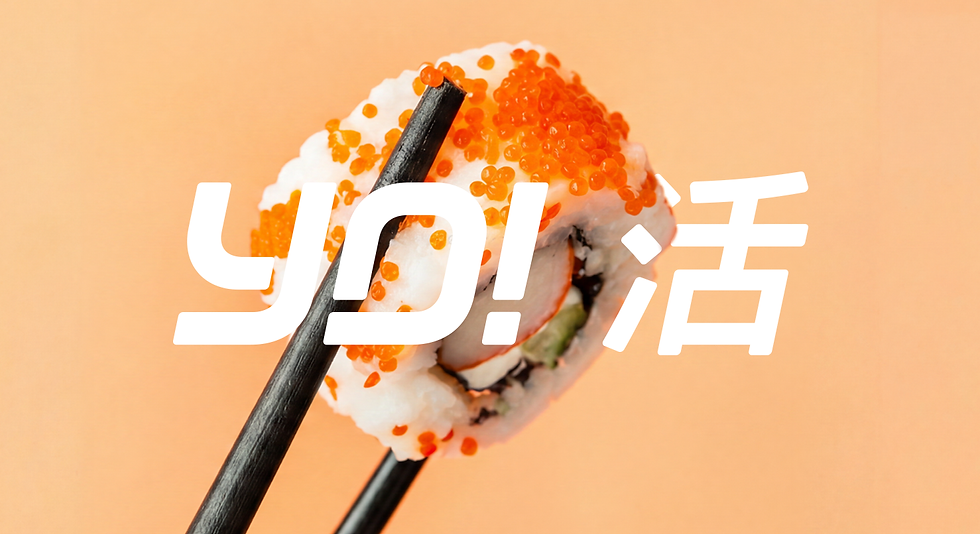

The campaign was developed to push beyond the sushi category and position YO! as a broader expression of Japanese street food culture — vibrant, fast and unmistakably urban. Art direction led every decision, from typographic treatment and colour through to how the work sat in real-world environments, ensuring each execution felt visceral and alive whether encountered in-store, on screen or out-of-home.
Creative and campaign development was managed across the full pipeline — concept, art direction, print and digital production through to final delivery — with brand consistency held firmly across every touchpoint. The result was work that honoured YO!'s cultural roots whilst pushing the brand forward with genuine creative conviction.
